Flyer, Poster & Graphic Design
- 4.2
- Rating
- 10.00M
- Installs
- Free
- Price
 Analysis by App-foxy
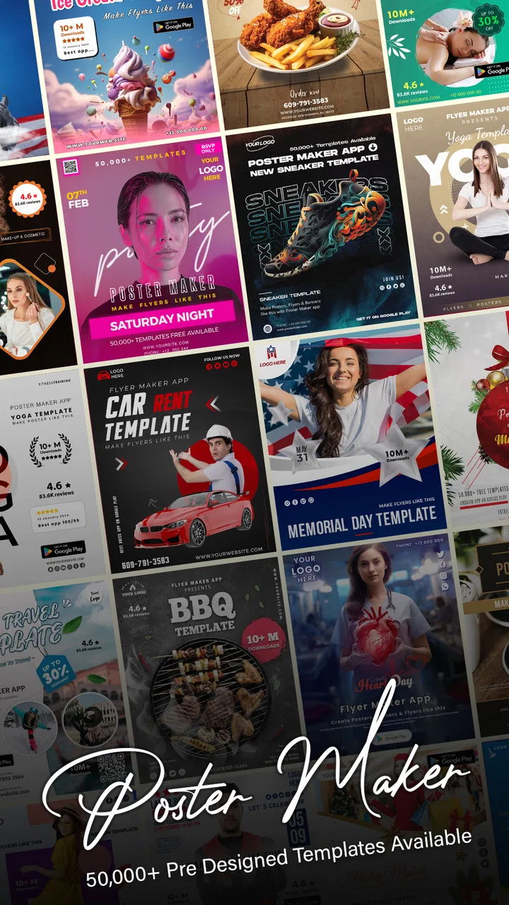
I opened Flyer, Poster & Graphic Design expecting a quick way to assemble a simple visual, and that is still the best way to understand it. This is a free Android art and design app from Technozer Solution for making promotional graphics, notices, invitations, social posts, banners, and similar pieces without starting from a blank professional canvas. I found it most useful when I already knew what I wanted to communicate and needed help turning that idea into something presentable.
The app has a broad audience. A small seller can prepare a weekend offer, a student can make a club announcement, and someone organizing a local event can produce a shareable poster without learning desktop design software first. Its age rating is Everyone, which fits the general-purpose nature of the tool. At the same time, “easy” does not mean effortless for every person or every situation. The experience depends on how comfortable you are with touch controls, small interface elements, visual contrast, and the patience required to adjust a design on a phone.
How Flyer, Poster & Graphic Design feels in everyday use
The first thing I noticed is that the app is built around getting to a finished composition quickly. Instead of treating design as a technical project, it presents the task as a series of practical choices: select a starting layout, change the wording, adjust the visual elements, and prepare the result for sharing. That approach makes more sense for a person who needs a flyer tonight than for someone who wants complete control over every point, curve, and typographic detail.
You May Also Like

 AccuWeather: Weather Radar
AccuWeather Review: A Quick, Clear Forecast for Everyday Decisions
For everyday plans, the best forecast is the one you can understand quickly. AccuWeather makes rain timing, radar, and local conditions easy to act on, with a few trade-offs.

 Hill Climb Racing
Why Hill Climb Racing Still Turns Crashes Into One More Run
A tiny car, a bumpy hill and one more upgrade: Hill Climb Racing keeps resurfacing because its simple chaos makes every near-miss feel personal.

 AliExpress - Shopping App
AliExpress Makes Global Shopping Feel Personal, but Shoppers Bear the Risk
AliExpress turns a global marketplace into a pocket-sized discovery engine. Its reach is useful, its shopping loop compelling, and its trade-offs easy to miss.

 Lords Mobile: Kingdom Wars
Lords Mobile Is a Kingdom-Building Routine, Not a Quick Match
A case-by-case verdict on the building, battles, device demands, and social commitments that make Lords Mobile rewarding for some players and exhausting for others.

 PDF Scanner app - TapScanner
TapScanner Makes Paperwork Easier to Capture, Check, and Share
TapScanner makes scanning with a phone feel less like a rescue operation and more like a dependable step in getting work done. Its capture tools are useful, though not flawless.
 Block Blast!
 Shows How Much a Puzzle Game Can Leave Out
A quiet grid game shows why puzzle players increasingly value instant clarity, repeatable skill and low-pressure play—and where the genre still needs to catch up.
More From Our News Desk
View All News

I would describe the interface as approachable rather than minimal. A design app needs several tools at once, so there is always some visual density. New users may recognize the main editing actions quickly, but discovering the less obvious controls takes experimentation. I recommend beginning with a deliberately simple project instead of trying to create a complicated event poster immediately. That gives you time to learn where text editing, visual adjustments, and export-related actions sit without the pressure of a deadline.
Readability matters more here than many people expect. A template can look attractive while still being difficult to scan once you add your own words. I found it helpful to keep the main message short, use a clear order of importance, and check the finished graphic at the size where people will actually see it. A phone-sized preview can hide problems that become obvious when the image is used as a printed notice or viewed in a busy social feed.
The most useful habit is to design for the reader before decorating for yourself. Put the event, offer, date, or action near the visual center of attention. Secondary details can remain smaller, but they should not become so small that someone has to zoom in. Flyer, Poster & Graphic Design gives you a convenient place to arrange these elements, but it cannot decide whether your final message is genuinely readable.
Navigation and reading comfort
For me, the app works best when I treat each screen as a focused editing step. I avoid changing several things at once because it becomes harder to tell which adjustment improved the design and which one introduced clutter. This is particularly useful for users who find crowded screens tiring or who need more time to process multiple visual choices. A slower, one-change-at-a-time workflow is less frustrating than repeatedly undoing a busy composition.
People with reduced vision should pay attention to the relationship between the background and the text, not just the size of the letters. Decorative backgrounds, pale text, and low-contrast overlays may look polished but can make the message inaccessible in practice. I would choose a stronger contrast first, then add decoration only if it does not compete with the words. The app can help you place content, but the responsibility for a legible result remains with the designer.
Users who rely on magnification may find a phone editor workable for short sessions, especially if they enlarge the screen before making precise selections. The trade-off is that zooming can make it harder to understand the whole layout at once. I prefer alternating between close editing and a full composition check, because a change that looks correct in isolation may push another element too close to an edge or make the hierarchy confusing.
For users who are sensitive to visual overload, I would avoid starting with highly decorated layouts. A restrained design with fewer competing elements is easier to inspect and usually communicates more effectively anyway. This is one of the app’s practical strengths: it can support a simple workflow, provided you resist the temptation to treat every available design element as necessary.
Touch control, motor effort, and sensory context
Editing a graphic on a touchscreen involves repeated taps, dragging, selecting, and sometimes fine positioning. That can be comfortable for short tasks but tiring for someone with limited dexterity, hand tremors, joint pain, or difficulty maintaining a precise touch. I would plan the layout before opening the editor and keep the number of adjustments low. Starting with a close-fitting design is more accessible than choosing a visually exciting layout that requires constant resizing.
Small targets are another consideration. When several objects sit near one another, selecting the intended item can take extra attempts. I found that leaving breathing room between text and decorative elements makes the editing process easier as well as improving the final design. This is a useful trade-off: a little empty space reduces accidental selections and gives the reader a clearer path through the message.
One realistic example is a community volunteer preparing a last-minute notice on a phone while standing in a noisy hall. In that situation, the problem is not only whether the app can create the graphic. Glare, interruptions, one-handed use, and limited concentration all affect the result. I would draft the wording in advance, use a simple layout, enlarge the key message, and review the completed image somewhere quieter before sharing it. The app is suitable for that kind of quick production, but the surrounding conditions still shape how accessible the task feels.
For people who are sensitive to bright screens or busy imagery, a calm composition is easier to work with than a highly layered one. I also recommend taking breaks during longer editing sessions. Flyer, Poster & Graphic Design is convenient because it puts the work on a mobile device, but mobile convenience can encourage people to keep editing in uncomfortable conditions, such as poor lighting or while moving around.
Where mobile access is genuinely useful
The strongest situational advantage is immediacy. I can imagine using this app when a small business needs a same-day promotion, a teacher wants a visual reminder for a class activity, or a family needs an invitation that looks more considered than a plain text message. These users may not need a full design suite; they need a reasonable result without opening a computer and learning a complicated professional workflow.
It is also helpful for people who work across changing locations. A phone-based editor can be more practical than a desktop tool when the idea appears during a commute, between appointments, or while coordinating an event away from an office. I would still do the final review in a stable setting. Mobile editing is excellent for speed, but it is less comfortable when exact alignment, detailed proofreading, or print preparation matters.
The app’s free entry point makes it easy to test whether this style of creation suits you. It has reached over ten million installs and holds a 4.3 average from around one hundred fifteen thousand ratings, so it is clearly used by a large audience rather than being an obscure experiment. Those figures do not guarantee that every person will enjoy the workflow, but they do suggest that the basic idea is approachable enough for many casual creators.
There is a financial point worth keeping in mind. The app is free to install, while optional purchases range from about one dollar and fifty cents to around sixty dollars per item. I would explore the free workflow first and decide whether the available tools match my needs before spending anything. This matters especially for occasional users: if you only make a few simple notices, a paid addition may not provide enough value to justify the cost.
Practical workflows that save time
My preferred workflow begins with the audience and the viewing distance. For a social post, I keep the central message compact and make the first line do most of the work. For a printed notice, I allow more space around the edges and make contact or scheduling details easy to locate. For a banner, I simplify further because people may see it briefly or from far away. The same editor can serve these situations, but the design decisions should not be identical.
A second useful technique is to create a visual priority before adjusting colors and decoration. I decide which item must be noticed first, which information supports it, and which details can be omitted. This prevents a common mobile-design problem: spending time making the background attractive while the actual instruction becomes hard to find. The app is much more effective when used as a communication tool rather than as a collection of effects.
I also recommend proofreading after the design is visually finished. Editing text inside a graphic can make familiar words easy to overlook, especially when the layout is attractive. Read the message as if you were a stranger who has no context. Check names, times, prices, spelling, and the action you want the viewer to take. This is a small step, but it prevents the kind of mistake that a template cannot catch.
Another trade-off concerns consistency. If you make several graphics for the same club, shop, or event series, repeating a small set of colors and text treatments makes them feel related. However, forcing every poster into the same crowded style can reduce readability. I would preserve the important visual cues and simplify whenever the message changes. Consistency should help recognition, not become a reason to keep unnecessary decoration.
How it compares with familiar alternatives
Compared with writing a notice in a word processor, Flyer, Poster & Graphic Design is more visually direct. It encourages a finished poster-like result instead of leaving you to manage page layout manually. That makes it a better fit for promotional graphics and social visuals than a basic document editor. The word processor remains preferable when the main goal is long text, structured pages, or precise document formatting.
Compared with a full desktop design suite, this app is less intimidating and more convenient for quick work. I would choose the desktop option for detailed brand systems, complex image manipulation, exact print specifications, or projects that require extensive layer control. The mobile app wins when speed, portability, and a gentle learning curve matter more than professional depth.
It also occupies a useful middle ground between a blank canvas and a highly automated design service. A completely blank tool offers freedom but demands more design knowledge. A heavily automated service can be fast but may make the result feel less personal. Here, the starting structure can reduce the fear of an empty screen while still leaving room for your wording and choices. The limitation is that your final work may still feel template-led if you do not make thoughtful changes.
On older or less capable devices, I would keep projects modest and avoid expecting the same fluidity as a desktop workstation. The minimum operating system is Android seven, and the current release is version nineteen point one point two. That broad compatibility is helpful for people who do not replace phones frequently, although the actual comfort of editing will still depend on the device’s screen, responsiveness, and available space.
Who will benefit, and who should look elsewhere
I would recommend it to casual creators, small sellers, students, community organizers, parents preparing invitations, and anyone who needs a polished visual without a long training period. It is especially suitable when the message is short, the deadline is close, and the design does not require highly specialized production control. The free starting point also makes it reasonable to try before committing to a different workflow.
I would be more cautious for users who need rigorous accessibility review, complex brand governance, collaborative editing, or advanced professional output controls. Someone producing large volumes of marketing material may eventually prefer a tool with a more systematic asset and style workflow. A person who needs to manipulate detailed illustrations or photographs should also compare this app with a dedicated image editor rather than assuming a poster-focused tool will cover every requirement.
It may not be the right choice for someone who dislikes touch editing or needs a keyboard-and-mouse workflow. Precision work can feel slower on a phone, particularly when several elements overlap. Users with motor difficulties should test the basic editing actions before building an important project, because the convenience of mobile access does not remove the physical demands of repeated touch input.
My inclusive verdict
After using Flyer, Poster & Graphic Design, I see it as a practical mobile design companion rather than a replacement for every creative tool. Its real strength is lowering the distance between an idea and a usable visual. That matters for people who need to communicate quickly and do not want to study professional design software first.
Its inclusive value comes from flexibility of purpose and a relatively approachable starting point, not from eliminating every barrier. Clear wording, strong contrast, generous spacing, and a simple layout can make the experience better for more people. Those choices also improve the design for users without specific accessibility needs, which is why I consider them part of good practice rather than special adjustments.
I would install it for quick flyers, announcements, invitations, and promotional images, then judge the free workflow on a real project. I would not choose it blindly for detailed print production, extensive collaboration, or work demanding exact professional controls. For the right situation, it is an efficient way to make a graphic on Android, and its Everyone rating, free access, and large user base make it approachable. Just remember that the app supplies the workspace; thoughtful, readable communication still comes from you.
FAQs for Flyer, Poster & Graphic Design
01What features does Flyer, Poster & Graphic Design offer?
Flyer, Poster & Graphic Design provides a comprehensive set of tools for creating professional-quality designs. Users can access a wide range of templates for flyers, posters, and graphics, along with customizable fonts, colors, and images. The app also supports layering and advanced editing options to enhance creativity and precision.
02Is Flyer, Poster & Graphic Design suitable for beginners?
Yes, the app is designed to be user-friendly with an intuitive interface that caters to beginners and professionals alike. It offers guided tutorials and easy-to-follow instructions to help new users navigate the design process smoothly. Advanced features are also available for experienced designers seeking more control.
03Does Flyer, Poster & Graphic Design require an internet connection?
The app can be used offline for most design tasks, making it convenient for users without consistent internet access. However, certain features like template downloads or cloud-based saving require an internet connection. Regular updates and additional resources might also need connectivity to access the latest content.
04Can I share my designs directly from the app?
Absolutely. Flyer, Poster & Graphic Design includes built-in sharing options that allow users to export and share their creations directly to social media platforms, email, or cloud storage services. The app supports multiple file formats, ensuring compatibility with various platforms and printing services.
05Are there any in-app purchases or subscription fees?
While Flyer, Poster & Graphic Design offers a free version with basic features, some advanced tools and premium templates may require in-app purchases or a subscription. Users can choose between monthly or yearly plans to access additional content, with a trial period often available for new subscribers.
Pros
- Easy-to-use interface for beginners.
- Wide variety of templates available.
- Quick export options for multiple formats.
- Integration with social media platforms.
- Customizable font and color options.
Cons
- Limited free version features.
- Occasional app crashes reported.
- In-app purchases can be pricey.
- Requires stable internet connection.
- Some advanced tools difficult to find.

Flyer, Poster & Graphic Design
Gallery